My Projects
Here are some of my recent projects. I'm always working on something new, so check back often!
 In Progress
Ask Wikipedia Anything RAG + SLM
In Progress
Ask Wikipedia Anything RAG + SLM 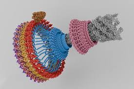 Automated Flagellar Motor Localization in Cryo-ET Machine Learning + BioPhysics
 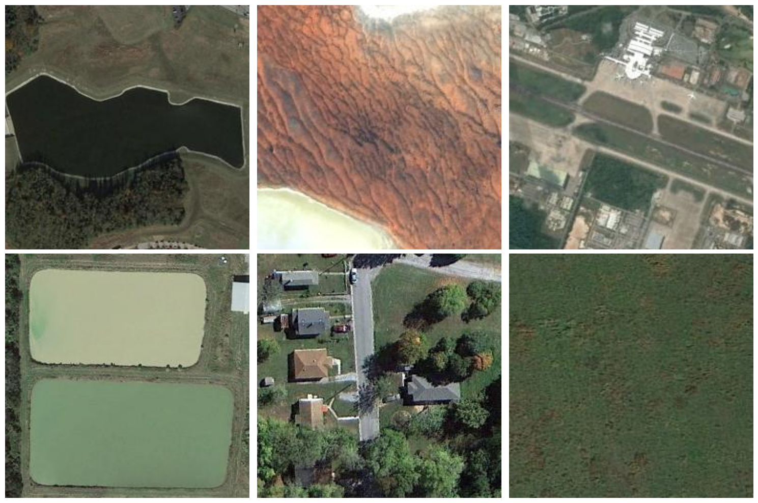 Skyview Aerial Landscape Classifying land based on satellite images
 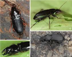 Carabid Beetle Classification British carabid beetles
 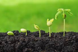 Capstone: Agricultural Retail Business Analysis Inventory Optimisation + Sales Trends
 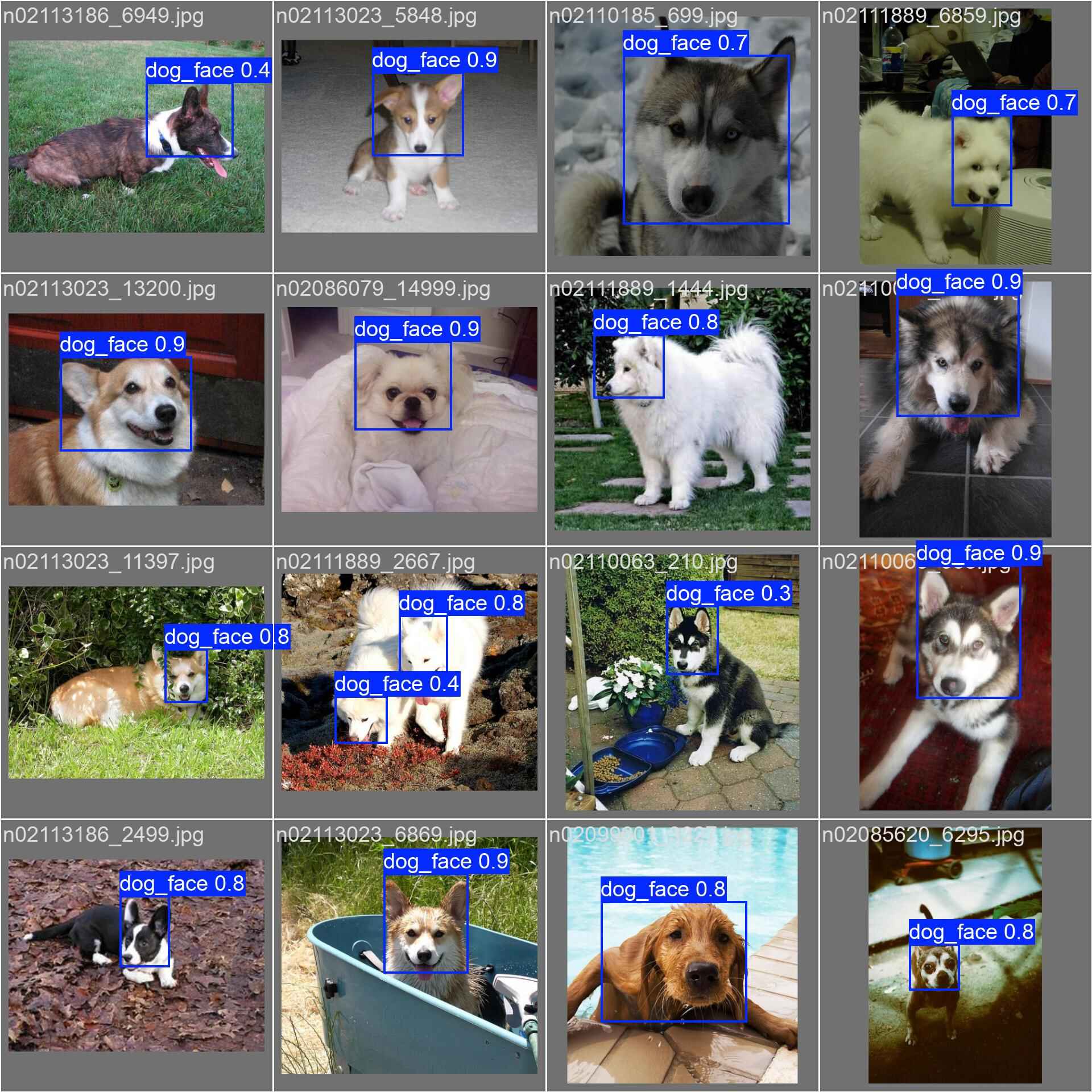 Dog Face Detection using YOLOv8 Object Detection
  Houc Connects Service Professionals with Customers
  FlaskTunes Full-featured music streaming application
  Shortier Shorten URL from your terminal